Canfield Scientific
I joined Canfield Scientific in 2010 as the company’s first product designer. I lead the design on Canfield’s online products: websites, mobile apps, email marketing, and even some desktop apps. Before joining Canfield, everything I’d worked on was consumer based. I wrote about my experiences designing for healthcare.
Clinical Services App
One of the main reasons Canfield hired me was to work on it’s clinical services web app. Canfield Clinical Services accounted for more than half of the company’s ongoing and recurring revenue, but our web product’s UX lagged. I was immediately asked to reimagine the UX and redesign it from the ground up.
A bare-bones version of an app existed, so I started by reviewing analytics and interviewing users to understand how the product was currently used. With these insights, I prototyped new workflows and lead critique sessions to review and iterate on them. I started with wireframes, moved into higher fidelity design, and eventually wrote HTML/CSS to design with real data.
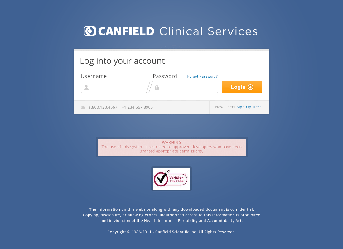
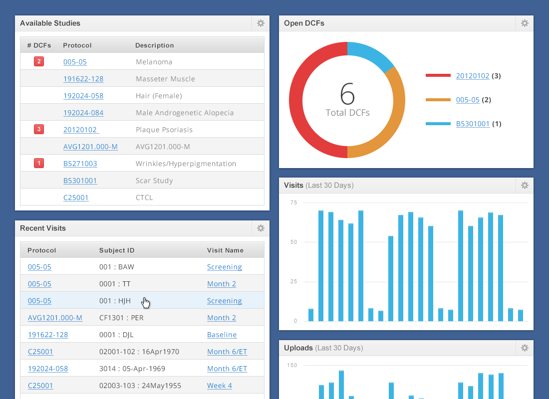
The app had just a handful of screens, but each one included numerous states and edge cases. Things like oversized photos, missing text fields, and long file names would often break layouts and force us to adapt. I worked with my team to find and fix bugs using a device lab and virtual machines.
I really submerged myself in fixing browser bugs on this project. We supported everything from the retina iPads to Internet Explorer 6 (it’s the healthcare industry 😉). Every page also prints clearly. Even the modals. Even in IE6.
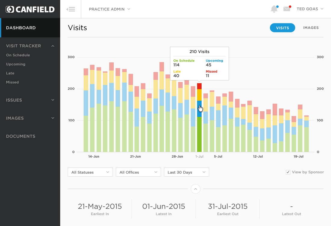
After launch, we received an overwhelmingly positive response from our clients. Comments ranged from “the website is more useful now” to “the website is simply a pleasure to use”. Someone even referred to it as the “Cadillac” of clinical websites.
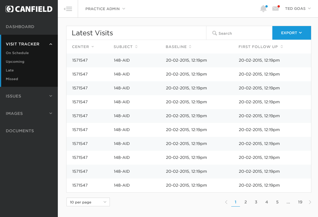
We periodically revisited our Clinical Services product to revisit our assumptions and expand the product’s features to use cases and expand its prospect pool.
Corporate Website
With the Clinical Services app in a better place, the Canfield wanted to attract new customers to other parts of the business. The company website has been neglected and didn’t tell the company’s story or explain our capabilities very well, making it hard for prospects to understand how Redesigning the company website was one of the larger projects I worked on during my time at Canfield. This project was personal to a lot of people, and its redesign brought out a lot of emotions. Stakeholders were proud, opinionated, worried, territorial. Everyone had the same goal for the site, but a different opinion on how to get there. It was my job to capture everyone’s vision and balance it with the needs of the business.
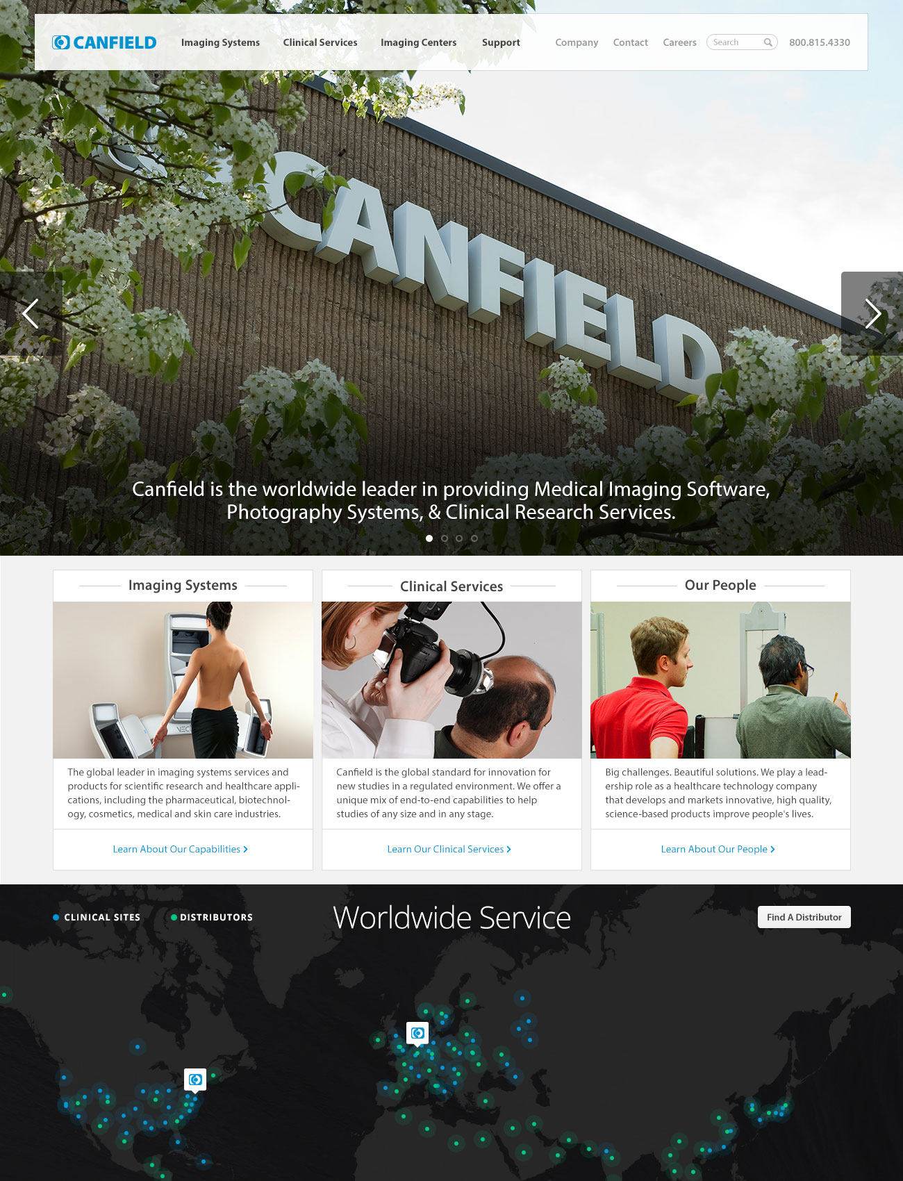
I was asked to lead, but wasn't in charge
I asked each stakeholder what success looks like and noted their answer. I worked directly with the company owner to mold these inputs into an accurate portrait of his company. I led countless design reviews and demos, organized feedback, and prioritized resulting work.
I iterated the design throughout the project, but having documented goals to reference avoided churn. Ultimately each design we produced succeeded when it solved the problem, not because “everyone liked it.”
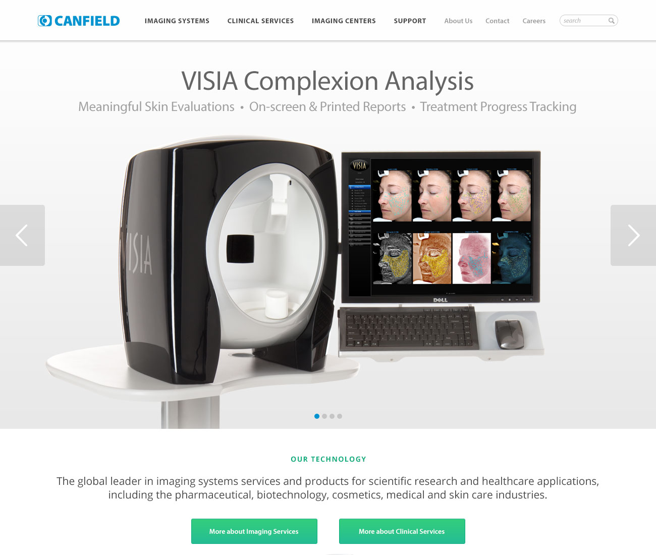
The redesign was met with overwhelming positivity. Clients approached us at conferences, commending the site’s way-finding systems and refreshed content. Each business segment felt accurately represented and stakeholders now had tools to maintain their area of the site. Much of my original design is still on the live site.
This project helped me understand how stakeholders can be skeptical and risk-averse, and why they can view new ideas as a threat. I learned to frame my suggestions as solutions to their problems and effectively sell my design vision.
Small projects
At any given time, I usually had one large project on my plate, as well as one or two small projects. Here are a few small projects I'm proud of.
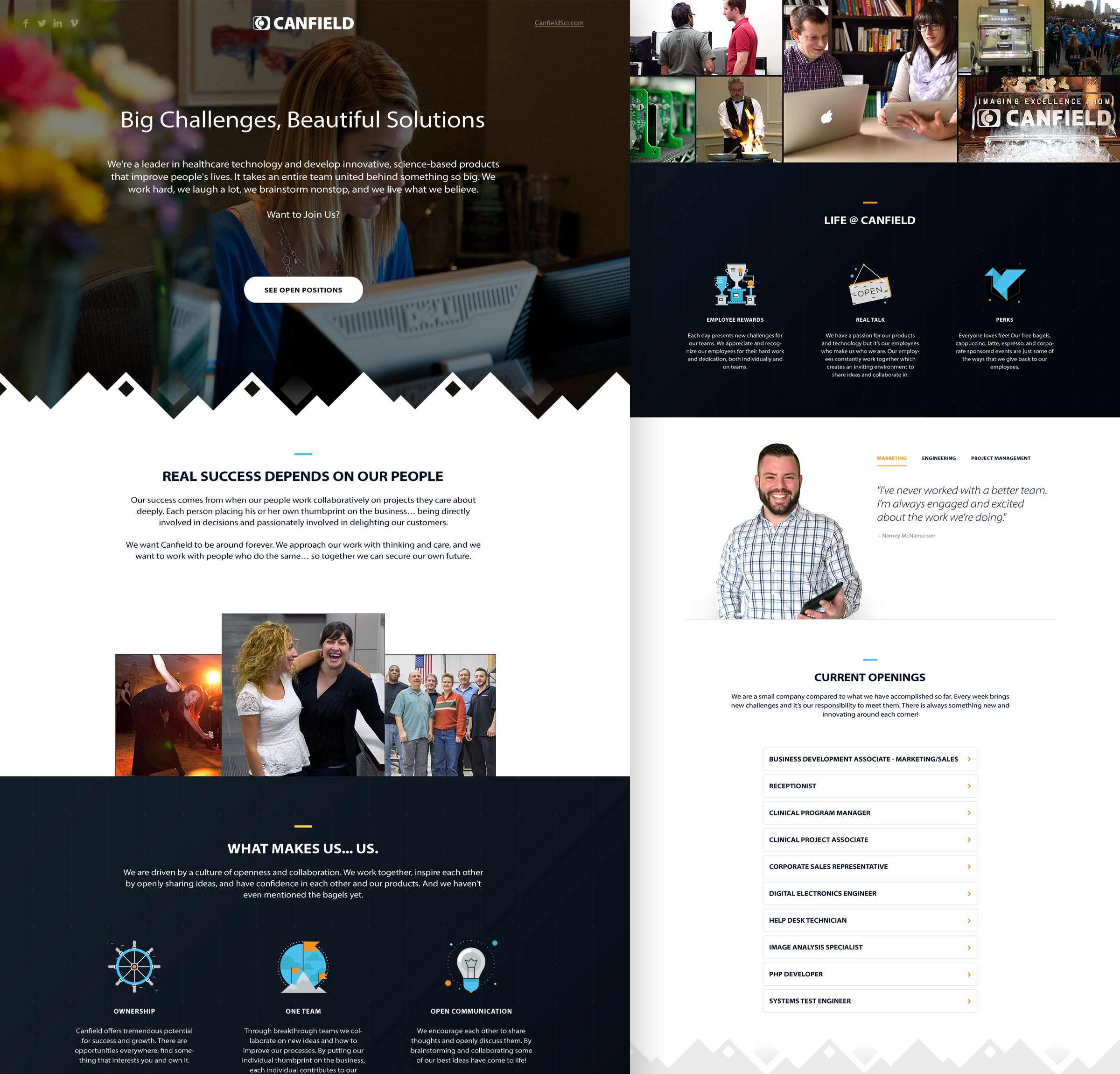
At one point the company was having ahard time recruiting folks to expand our product and engineering teams. I pitched the idea to create a careers microsite that put our best foot forward to potential new hires. I led the project from the start, including its research and design. Sadly I left the company before shipping it.
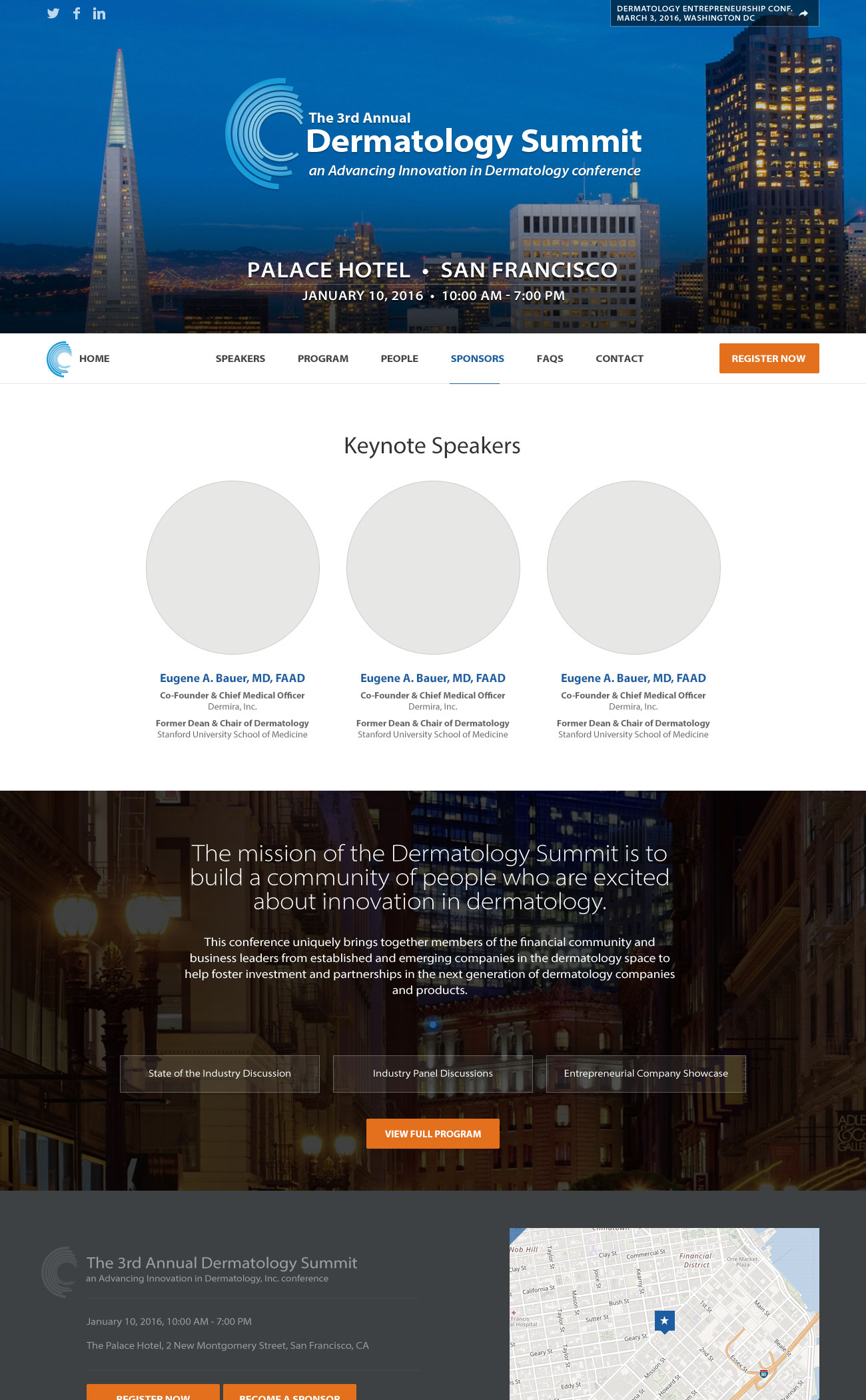
I designed the Derm Summit conference website each year as part of Canfield's involvement in the dermatology community. I worked directly with the conference organizers to update the site as speakers and sessions were confirmed. Derm Summit 2016 was the last website I contributed to.
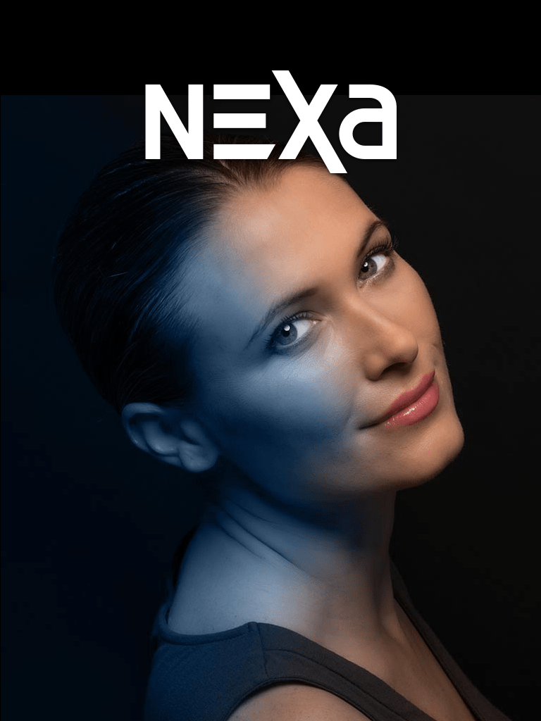
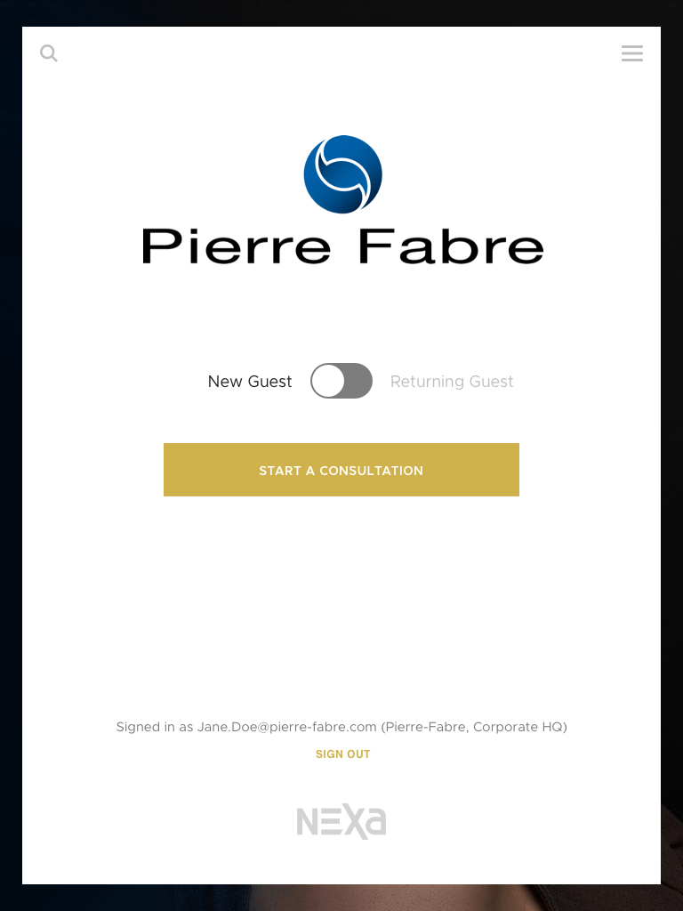
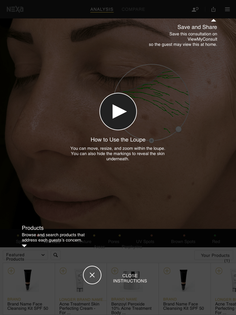
I worked on several iPhone and iPad apps, most of them for large pharmaceutical companies (and under NDA). Most of them focused on taking a patient's photo, analyising it in real time, and suggesting treatments. I designed several photo-capturing interfaces and editing tools.
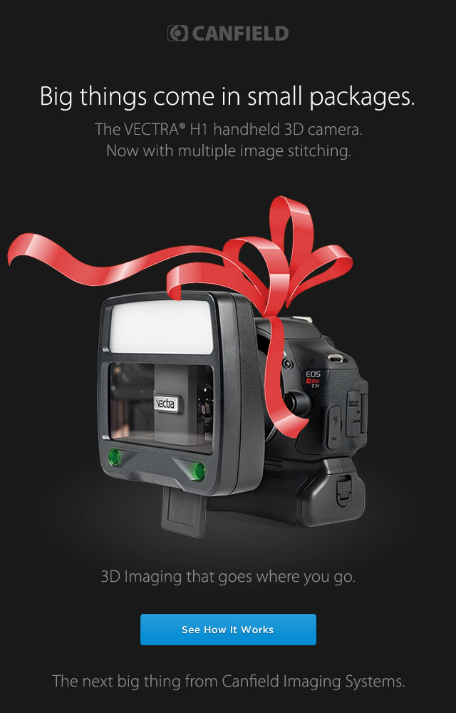
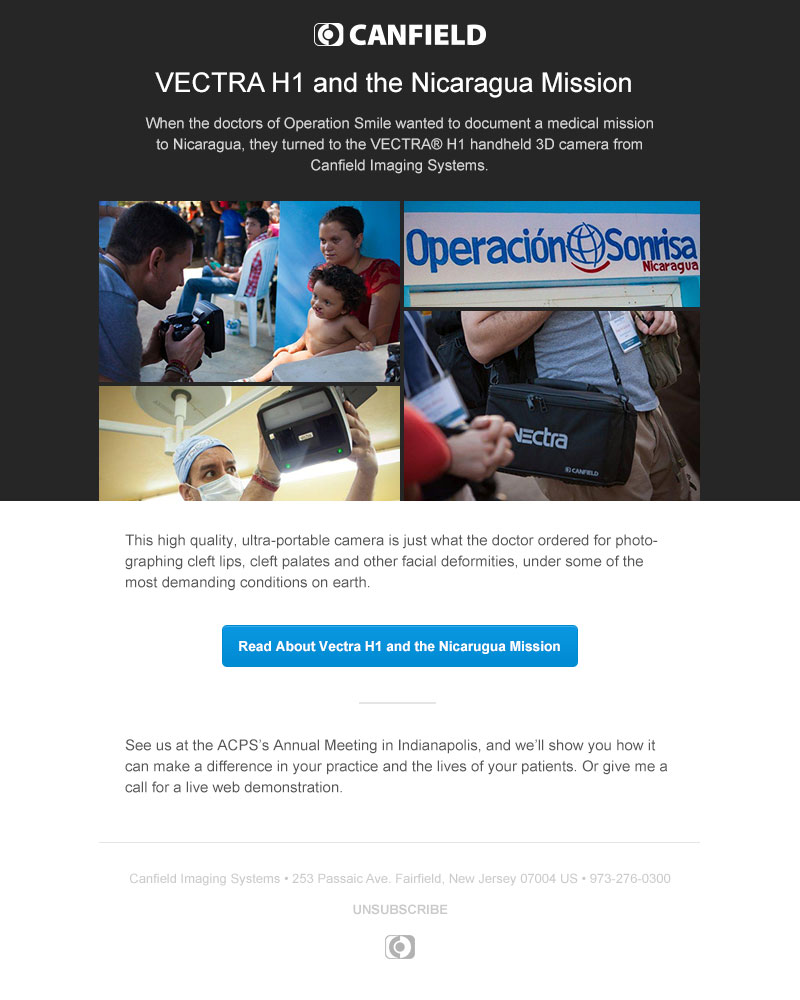
I was responsible for every email Canfield sent, about 20-25 promotional emails a year and any transactional emails from our products (password reset, account confirmation, etc.). I worked with stakeholders to design, code and QA each email in popular email clients using Litmus. I also scheduled our promotional emails in Campaign Monitor and reported back metrics to the team.
